This document sets the rules for the use of the tprmedia logo system and the use of the company name in all text. Please check this page regularly to ensure you are complying with tprmedia company guidelines.
There is a “link” to this document as a PDF.
Our vision
To grow as a world-class digital content agency. Producing inspiring and incredible content.
Typeface
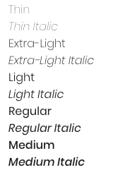
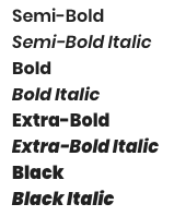
The company typeface is Poppins Light (https://typefaces.google.com/specimen/Poppins)
Use of the company name in text
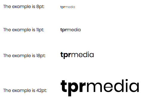
For typeface sizes, 6 to 8pt the letters TPR are in lowercase in Poppins Medium. The words are not separated. The word MEDIA is in the standard Poppins Extra Light.
For typeface sizes, 9 to 13pt the letters TPR are in lowercase in Poppins Medium. The words are not separated. The word MEDIA is in the standard Poppins Light.
For typeface sizes, 14pt to 20pt the letters TPR are in the usual lowercase but they are Poppins Semi Bold. The word MEDIA is in the standard Poppins Light.
For typeface sizes beyond 20pt the letters TPR are in the usual lowercase but they are Poppins Bold. The word MEDIA is in the standard Poppins Normal.
Colour codes
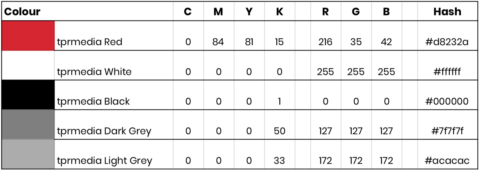
Follow all the colour values in the chart
Logo use and alternatives
The tprmedia logo is the immediate representation of our brand, it represents a valuable asset to the company and must be carefully controlled to ensure it’s applied consistently.
The logo must have sufficient contrast to the background for legibility. We suggest a tonal difference of 45 percent. We do not permit the use of tints.
If you are unsure or require further information about using our logo, please contact us.
Put the download link here
Standard Configurations
This is the standard configuration of the logo. On standard document presentations, the ‘Square’ logo is to be used where space is limited around the logo.
When the logo is being used on large displays, banners, posters etc. the ‘long’ logo is to be used.


Black & Grey derivatives
These versions of the logo are for use in black and greyscale printing only



Translucent logos
Translucent logos must use tprmedia white for the words. If the background is not the prescribed 45 percent tonal difference we suggest using either the black, grey or standard logos

